Reinventing EngagementHQ: The vision behind our new redesign
We’ve redesigned different parts of our product many times over the years, and the evolution always starts with one thing: a clear product vision.
Product vision is the bridge between strategy and execution, and it’s the catalyst for moving our teams towards a compelling and coherent future. Over the past 16 years, our vision has guided us to establish a unique breed of SaaS for digital engagement focused on great user experiences and ensuring digital engagement is easy and accessible to all organisations.
Today, we are revealing the next iteration of EngagementHQ. The previous version: Blue Haven, is more than three-years-old, so we knew we needed an ambitious new vision for the next generation of EngagementHQ. Here’s how we did it.
Surveying the landscape
Product:
- Our design required greater tool configuration and customisation — as a result, we are rethinking how we create, review, and publish projects.
- For customers in the field and at their desks, our admin interface required optimisation for ‘on-the-go’ engagement across all devices.
- To deliver rich and rapid insights, we wanted to support more meaningful takeaways with better dashboards, advanced text analysis, and customised reporting.
- To deliver more new features more often, we needed consistent design elements to help us move faster to get new functionality to market.
Market:
- As a leader in community engagement SaaS products, newcomers often replicated the EngagementHQ look and feel, homogenising our offering. We wanted to continue to provide more than just new tools to push the industry forward.
- As a global product, we see organisations’ use our software differently worldwide. That insight helped us identify that successful EngagementHQ users create entire engagement ecosystems — a successful approach we want to continue to support.
Customers:
- As our customers‘ technology stacks and engagement practice advanced, requests increased to make engagement tools embeddable, accessible, mobile-first, and incorporative of AI and machine learning.
- Community members expect online experiences consistent with the technology they use daily, so we wanted to exceed their expectations.
Business:
- As part of the broader Granicus platform, we needed to improve interconnection across product families so Granicus customers can access the entire platform to activate residents everywhere.
- EngagementHQ tools are critical to businesses because they help to drive awareness and demand, which is why we chose to reinvest in them.
The landscape was primed for an EngagementHQ redesign, and the need for a change was evident.
Laying the groundwork
Rolling out the Blue Haven interface update in 2020 taught us that an iterative release with minimal customer impact was critical to a successful launch. It captured the need for a clear vision, so we decided to focus on three key areas:
Tools
Refresh core tools and make them embeddable, stand-alone, performant, and accessible.
Reports
Introduce new shareable dashboards and better tell the story of who is saying what.
Participants
Remove barriers to participation with a clean architecture and mobile-first interface.
With our focus locked in, our product team got to work. We ran workshops, gathered customer insights, and uncovered critical components of the new design.
Crafting the vision
We learned from our research and previous work that we were not willing to compromise on four key factors: usability, clarity, consistency, and accessibility.
Usability was important to ensure our users could easily navigate the product and understand how to interact. We achieved this by using familiar patterns and ensuring that elements were easy to build with, reducing the need for custom coding, which allowed us to bring new features to the market faster.
Clarity was also essential. We wanted to ensure that users could easily understand the feedback they received on actions, such as “saved,” “delete,” or “sent.” To achieve this, we included more placeholders and hints in form fields and used consistent words and terms throughout the product to make navigation simple and intuitive.
Consistency was another key factor. We wanted every page to have the same title and button area, with the same font sizes so users can quickly see what their options are on the page. We also set button positions, icons, and colours for topics and statuses for a cohesive and polished look.
Finally, we recognised the importance of accessibility. We structured our design for accessibility by testing the colour contrast and aligning it with global standards to make it easy for all users to access and use our product.
Exploration and validation
Our first piece of exploration was to audit and collect information about the various page types in our user interface and map the consistent areas within them to:
- Identify all page types
- Get a feel for the level of consistency
- Identify and reduce unnecessary variations
- Improve usability
A new component library would allow one set of styles to be applied efficiently to the identified areas. It took months of investigation, but we narrowed it down to two component libraries for comparison: Material by Google and Carbon by IBM.
After our audit and selection of candidates, we worked on a comparison to determine which best met our requirements, many of which were crucial for better filtering in reports and dashboards.
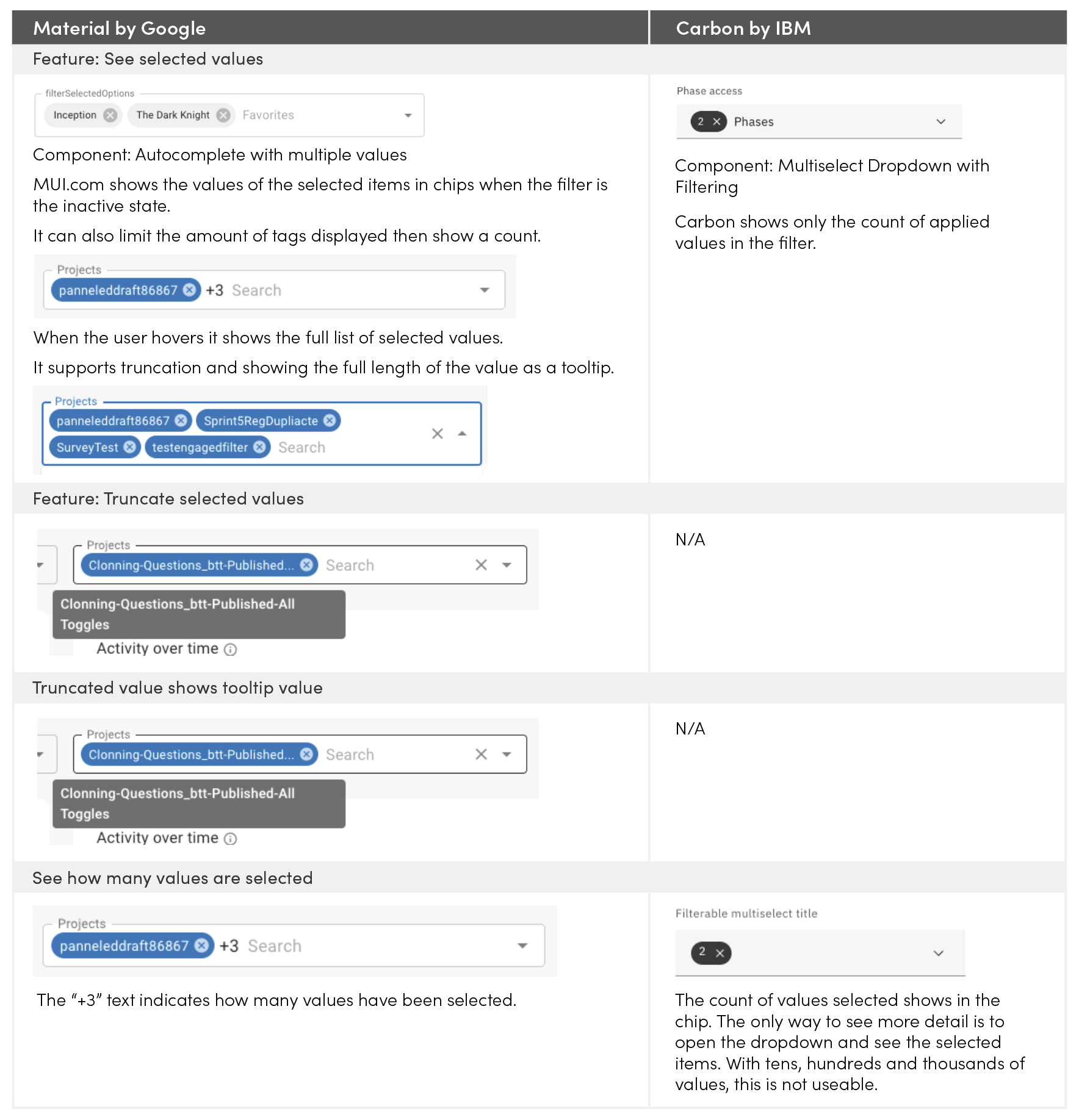
The deciding factor was the dropdown option and the look and feel. We had the most collective confidence in Material components. Adding elemental designs made the vision feel fully coherent and compelling. This decision enabled us to create a design system that would be our north star for all new features moving forward.
We now had a vision for both the “what” and the “how”. This asset was the catalyst for shifting our team into execution mode. And as we began to build, we continually referred to the style guide to ensure we hadn’t veered off course.
From vision to reality
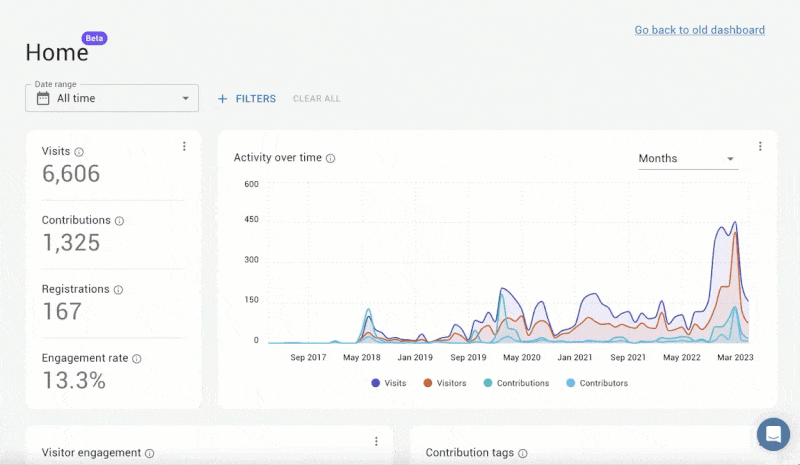
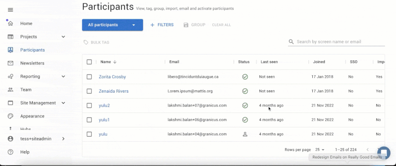
It’s been special to start to see our vision out in the wild in the form of our new participant profile, navigation, home dashboard, and participant management.
New home dashboard
New participant management
But it’s been even more special to see the reaction from our customers who are loving what they are seeing: “It helps us understand the overall level of engagement across the platform (which is something we are trying to address).”
So that’s the story of our most recent reinvention and how we went from vision to reality. We can’t wait to share more of what’s to come.